
Spatial Analysis of COVID-19 Infection Patterns Using Unsupervised Classification with K-Means Clustering
- Bisiriyu Lawal Oluwafemi
- Oluwatobi Lucas Akinbode
- Ogunetimoju Abolaji Moses
- Sadoh Afeez Papa
- 170-183
- Mar 28, 2025
- Health
Spatial Analysis of COVID-19 Infection Patterns Using Unsupervised Classification with K-Means Clustering
Bisiriyu Lawal Oluwafemi1*, Oluwatobi Lucas Akinbode2, Ogunetimoju Abolaji Moses3, Sadoh Afeez Papa4
1Department of Statistics & Data Science, Obafemi Awolowo University, Ile-Ife Osun State, Nigeria
2Department of Mathematics & Physics, North Carolina Agriculture and Technical State University, Greensboro, United States
3Department of Statistics, Ekiti State University, Ado-Ekiti Ekiti State, Nigeria
4Department of Statistics, Auchi Polytechnic, Auchi, Edo State Nigeria
*Corresponding Author
DOI: https://doi.org/10.51584/IJRIAS.2025.10030012
Received: 21 February 2025; Accepted: 26 February 2025; Published: 28 March 2025
ABSTRACT
Although there has been extensive research on COVID-19 spread, however, a notable gap continues to exist in comprehending the spatial variability of its spread through advanced geospatial techniques. Many studies focus on temporal trends or analyses at the national level, frequently overlooking localized differences that affect the progression and severity of diseases. In this study, we conducted an in-depth Exploratory Data Analysis (EDA) to examine the global spatial and temporal distribution of COVID-19 cases. Using visual analytics such as count plots, bar charts, histograms, and box plots, we identified key trends in confirmed, active, recovered, and death cases. Our findings show that South Africa had the highest confirmed cases in Africa, while Russia and the United Kingdom led in Europe. Iran, Pakistan, and Saudi Arabia reported the highest cases in the Eastern Mediterranean, whereas the United States and Brazil recorded the highest peaks in the Americas. India had the most cases in Asia, while China reported the highest case counts in the Western Pacific. A correlation matrix indicated strong positive relationships between confirmed cases and deaths (0.91), recoveries (0.90), and active cases (0.95), showing that higher case numbers significantly influenced mortality and recovery trends. Spatial dependence analysis using Moran’s Global Index and the Getis-Ord Gi statistic confirmed notable clustering of COVID-19 cases. Hotspot analysis identified high case concentrations in North America, Europe, and Asia, while Africa and parts of South America exhibited lower infection rates. K-means clustering categorized the pandemic’s spread into two distinct clusters regions with the highest and lowest case counts. Our findings emphasize the non-random geographic distribution of COVID-19 cases, highlighting regional disparities and providing insights for targeted interventions.
Keywords: Covid-19, Spatial Analysis, Geospatial Techniques, Hotspot Detection, K-Means Clustering.
INTRODUCTION
Unsupervised machine learning is essential for discovering hidden patterns in historical data without any pre-established labels. This approach allows machine-learning models to independently identify similarities, differences, and structural patterns, rendering it an effective method for clustering and classification tasks (Lau et al., 2022). The growing availability of public COVID-19 datasets has spurred considerable research interest in utilizing data-driven methods to reveal epidemiological patterns (Rajshekhar et al., 2023).
An impactful use of unsupervised learning in epidemiology is grouping nations according to COVID-19 rates of incidence and mortality. Among different clustering methods, the K-means algorithm has shown greater efficiency in comparison to hierarchical clustering, fuzzy clustering, and model-based techniques (Noor et al., 2023). This approach groups data points according to feature similarities, frequently utilizing distance metrics like the Euclidean distance to enhance intra-cluster uniformity. Efficient feature selection is vital for enhancing clustering precision and guaranteeing that pertinent epidemiological factors influence model effectiveness (Ge et al., 2024).
The COVID-19 pandemic has caused significant worldwide effects, resulting in more than 220 million confirmed cases and about 4.6 million deaths in a span of two years (WHO, 2021). In addition to its severe health consequences, the pandemic has exerted substantial strain on healthcare systems, economies, and societal frameworks. A significant obstacle in managing pandemics is comprehending the spatiotemporal patterns of disease spread, which is crucial for implementing proactive intervention strategies (Cowley et al., 2022).
AIMS AND OBJECTIVES
The main aim of this study is to analyze and classify spatial patterns of COVID-19 infections using unsupervised K-means clustering while the specific objectives are to:
- Analyze regional COVID-19 patterns using EDA and graphical techniques, highlighting trends in cases, recoveries, and deaths across continents.
- Implement K-means clustering for segmenting COVID-19 infection data and identifying distinct spatial patterns.
- Evaluate the optimal number of clusters using the elbow method and validate clustering performance with multiple metrics.
- Conduct spatial autocorrelation and hotspot analysis to determine the geographic concentration and spread of COVID-19 cases.
JUSTIFICATION OF THE STUDY
This study leverages K-means clustering to uncover COVID-19 infection patterns, aiding in proactive public health decision-making. Identifying spatial clusters enhances resource allocation and supports targeted interventions, strengthening public health preparedness. A data-driven approach ensures objective analysis, contributing to spatial epidemiology by integrating machine learning for infectious disease analysis. This research offers valuable insights for future outbreak management.
METHODOLOGY
K-Means Clustering
An iterative algorithm that categorizes data into a predefined number of groups or clusters. Given an initial set of k means \( m_1^{(1)}, \ldots, m_k^{(1)} \), the algorithm proceeds by alternating between slopes. The first in k-means clustering is the assignment steps which involve measuring distances between k centroids and individual data points.
\[
S_i^{(t)} = \left\{ X_p : \|x_p – m_i^{(t)}\|^2 \le \|x_p – m_j^{(t)}\|^2 \; \forall j, 1 \le j \le k \right\},
\]
And each \( X_p \) is assigned to exactly one \( S^{(t)} \). The second step is called the updated step which updates the position of each centroid as the mean of respective data points belonging to each cluster.
\[
m_i^{(t+1)} = \frac{1}{|S_i^{(t)}|} \sum_{x_j \in S_i^{(t)}} x_j
\]
The process is reiterated until no centroid shifts exceed a specified threshold. Convergence is reached when the assignments remain unchanged, often depicted as assigning objects to the closest cluster based on distance (Hussein et al., 2021).
MATERIALS AND METHODS
The approach used in this study involves gathering and processing pertinent data, splitting it into training and testing groups, choosing an appropriate model, training the model, and assessing its performance. First, essential libraries and datasets are loaded into Jupyter Notebook or another Python IDE, then the datasets are preprocessed and different machine learning algorithms, including K-means clustering, are implemented. These measures are often utilized to assess unsupervised learning algorithms, which seek to identify patterns within data without predefined labels. They encompass the Silhouette Score for evaluating cluster similarity, the Davies-Bouldin Index for assessing cluster compactness, the Dunn Index for measuring cluster separation, the Adjusted Rand Index for labeling consistency, and metrics such as Homogeneity, Completeness, and V-measure for determining cluster purity. These metrics together aid in evaluating the quality of clustering and the significance of the resulting clusters.
Data Collection and Description
This research used information gathered from online repositories, featuring a store dataset acquired from Kaggle for demonstration purposes. The dataset includes daily case counts by country, along with information at the county/state/province level. The data was collected from official documents, directly via government communication channels, or indirectly through trusted local media outlets. The dataset has been cleaned with no missing value.
Optimal Number of Clusters
The elbow curve, referred to as the elbow method, is a visual approach employed in clustering analysis to identify the ideal number of clusters. It entails graphing the number of clusters in relation to a metric of cluster compactness or distortion, like the within-cluster sum of squares (WCSS). The location on the curve indicating a notable shift in slope, which looks like an elbow, is viewed as the ideal number of clusters. This approach aids in identifying the right balance between the complexity of the model and the effectiveness of clustering.
Model Evaluation
This method entails calculating several unsupervised performance metrics, such as clustering accuracy, silhouette score, and Davies-Bouldin index.
Model Classification
The code starts by importing key libraries: NumPy for numerical calculations, Matplotlib for generating plots, and `pairwise_ distances_ argmin` from scikit-learn, which is utilized to find the closest cluster centers in K-means clustering. It then establishes random starting centers for the clusters and iteratively assigns data points to the nearest center, adjusting the centers according to the average of the points in each cluster until they become stable (indicating they stop changing notably). After identifying the clusters, the code creates a scatter plot showcasing the COVID-19 data, coloring the data points based on their cluster labels (`labels`) and representing the cluster centers (`centers`) as semi-transparent black circles.
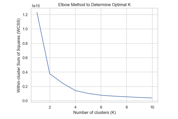
Figure 3.4: Elbow method
The diagram specifically uses elbow method to depicts K-means clustering with `k=2`, indicating the separation of data into two clusters according to their fundamental traits.
RESULTS
Exploratory Data Analysis
This study employs Exploratory Data Analysis (EDA) to examine variables, identify patterns, and analyze interrelationships. Various graphical techniques, including count plots, bar graphs, histograms, and box plots, are utilized to achieve this objective.
As seen in figure (1) below, South Africa has the most confirmed cases in Africa, suggesting that it will also record the highest number of deaths and recoveries. In Europe (figure 2), it is evident that Russia reports the most confirmed cases, whereas the United Kingdom has the most active cases; additionally, the United Kingdom records the highest number of deaths, while Russia boasts the greatest number of recoveries. In the Eastern Mediterranean (figure 3), it is evident that Iran, Pakistan, and Saudi Arabia have the most confirmed and recovered cases, while Iran records the highest number of deaths, and Pakistan and Saudi Arabia show the most active cases.
In America (figure 4), confirmed cases and active cases peak the highest in the United States, followed by Brazil. The United States has the highest death rate, while Brazil reports the most recovered cases. Figure (5) illustrates that in Asia, India reports the highest confirmed, recovered, death, and active cases. Additionally, Figure (6) indicates that in the Western Pacific region, China, the Philippines, and Singapore have the most confirmed cases, while China exhibits the highest peak in both death and recovery rates.
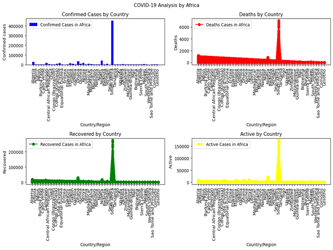
Figure 1: Covid 19 Pandemic Cases Spread Across African Countries
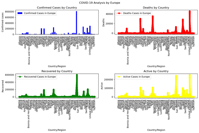
Figure 2: Covid 19 Pandemic Cases Spread Across European Countries
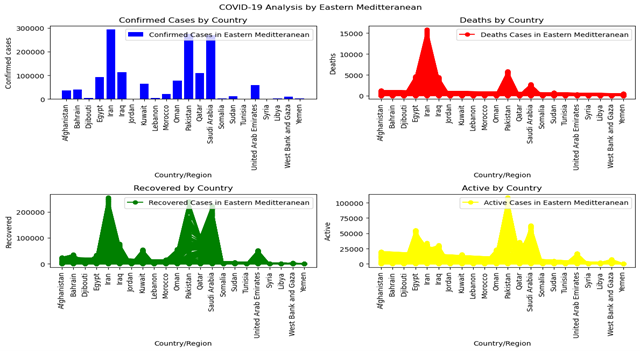
Figure 3: Covid 19 Pandemic Cases Spread Across Eastern Mediterranean Countries
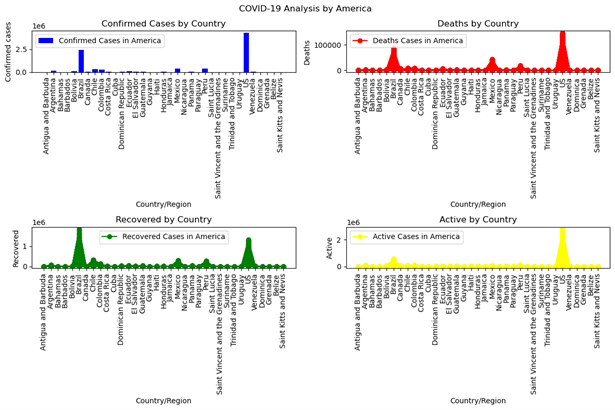
Figure 4: Covid 19 Pandemic Cases Spread Across Countries in America
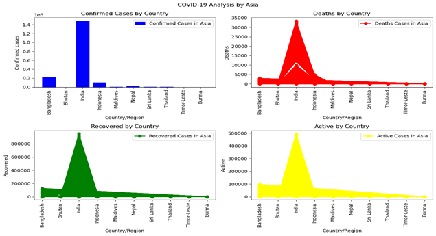
Figure 5: Covid 19 Pandemic Cases Spread Across Countries in Asia
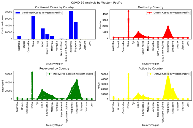
Figure 6: Covid 19 Pandemic Cases Spread Across Countries in Western Pacific
Correlation Matrix
This correlation matrix illustrates the connections between four variables: Confirmed cases, Deaths, Recovered cases, and Active cases. Every cell in the matrix shows the correlation coefficient between two variables, indicating the strength and direction of their connection. The relationship between Confirmed cases and Deaths is significantly strong at about 0.91, signifying a considerable positive correlation. This indicates that with an increase in confirmed cases, there is a notable trend for the death count to escalate too. In a similar manner, the relationship between Confirmed cases and Recovered cases is strong, approximately 0.90, signifying a positive correlation. This suggests that with a rise in confirmed cases, there is a propensity for the recovery count to also rise. The relationship between Confirmed cases and Active cases is notably strong, around 0.95, indicating a significant positive correlation. This suggests that with a rise in confirmed cases, the count of active cases (current cases) also generally increases significantly. Conversely, the relationship between Deaths and Recovered cases is moderately positive, approximately 0.76, signifying a positive association that is slightly weaker than the previously discussed correlations. Finally, the relationship between Deaths and Active cases is moderately strong, around 0.89, indicating a positive connection that is somewhat less robust than the correlation between Confirmed cases and Deaths.
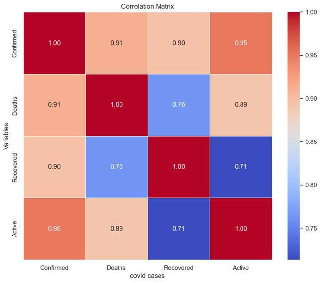
Figure 7: Correlation Matrix of Covid-19 Cases
Spatial Analysis
This section offers a comprehensive summary of the findings derived from the analytical techniques used to examine COVID-19 cases. We utilized the **Moran’s Global Index** to evaluate the general spatial autocorrelation of the data, enabling us to determine how clustered or dispersed COVID-19 case distributions are across various geographic areas. A notable Moran’s Index would suggest that COVID-19 cases are not randomly spread but show spatial dependence, indicating that adjacent areas often have similar infection rates (whether elevated or diminished). Along with the comprehensive spatial analysis, we conducted a **hotspot analysis utilizing the Getis-Ord Gi statistic, a localized technique that pinpoints distinct clusters of high or low concentrations of COVID-19 cases. The Getis-Ord Gi statistic aids in identifying regions (hotspots) with markedly higher case numbers compared to nearby areas, alongside cold spots where case numbers are considerably lower. These hotspot maps offer a detailed insight into the pandemic’s impact on particular regions, emphasizing places that may need focused interventions or deeper exploration of the fundamental factors influencing these spatial trends.
Spatial autocorrelation of Covid-19 cases
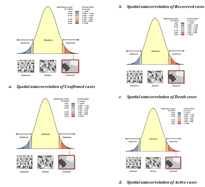
Figure 8: Spatial Patterns of Covid-19 Cases Prevalence Across Continent
The above figure 8 illustrates the results from Moran’s I tests regarding spatial autocorrelation for four distinct categories of covid-19 cases. The Spatial Autocorrelation of Confirmed Cases (a), depicted as a bell curve, illustrates a normal distribution where the majority of cases are concentrated in the middle range, while fewer cases appear at the extremes. The far left (blue) and far right (red) areas show considerable spatial autocorrelation. The Moran’s I statistic for verified cases is located in the right tail of the distribution, indicating positive spatial autocorrelation. This indicates that verified cases are concentrated in specific areas, as shown by the map and diagram on the right side of the graph.
Spatial Autocorrelation of Recovered Cases (b) exhibits a distribution akin to that of confirmed cases. The Moran’s I statistic for recovered cases is also located in the right tail, suggesting positive spatial autocorrelation. The grouping of recovered cases indicates that regions with a large number of recoveries are located near one another geographically.
The Spatial Autocorrelation of Death Cases (c), depicted as the bell curve, shows notable regions in both ends. The Moran’s I statistic for mortality cases is situated in the right tail, indicating positive spatial autocorrelation. This indicates that death occurrences are also spatially concentrated, and areas with elevated mortality rates usually lie close to one another.
The Spatial Autocorrelation of Active Cases (d) shows a comparable overall pattern and significance levels to the earlier graphs. The Moran’s I statistic for active cases is positioned in the right tail, signifying positive spatial autocorrelation. Active cases often group together geographically, with areas of high active cases situated close to one another.
Overall Interpretation
Confirmed cases do not occur randomly but tend to be concentrated in certain geographic locations. This implies that adjacent areas display comparable confirmed case counts, likely owing to spatial contagion or shared underlying risk factors in surrounding locales. The geographic grouping of recovered cases indicates that comparable factors (like accessibility to healthcare or localized treatment initiatives) might be affecting recovery rates in adjacent areas. The grouping of death instances may indicate underlying health system inequalities, regional weaknesses, or significant outbreaks in specific locations. Deaths are not scattered randomly; they show spatial dependence instead. The concentration of active cases may suggest current outbreaks or areas where the disease is spreading actively. These clusters depend on geography, which suggests that adjacent regions will likely show comparable case counts. In all four instances (Confirmed, Recovered, Death, and Active cases), the spatial autocorrelation findings show that the data is grouped instead of being randomly spread out. The existence of spatial clustering indicates that local factors or closeness are affecting the recuperation, and mortality rates associated with the illness.
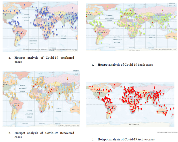
Figure 9: Hotspot Analysis of Covid-19 Cases Across Continents
Legends
The figure 9 above displays Hotspot analysis maps for COVID-19, illustrating the worldwide spread of clusters (hotspots) for Confirmed cases, Recovered cases, Death cases, and Active cases.
Hotspot Analysis of Confirmed COVID-19 Cases (A): Map A above displays blue and red indicators across various regions worldwide. Blue markers represent cold spots, indicating areas with fewer confirmed cases than expected, while red markers denote hotspots, signifying regions with higher-than-anticipated case numbers. Hotspots are primarily concentrated in North America, Europe, and parts of Asia, whereas cold spots are observed in regions such as Africa and certain areas of South America.
Hotspot Analysis of COVID-19 Recovered Cases (B): Map B displays orange and yellow indicators representing hotspots and cold areas for recovered cases. Orange markers indicate hotspots, primarily concentrated in North America, Europe, and Asia, while yellow markers denote cold areas, observed in Africa and South America.
Hotspot Examination of COVID-19 Deaths Cases (C): Map C features green and red indicators highlighting spatial clusters of death cases. Red markers represent areas with high death rates, primarily observed in North America, parts of Europe, and South America. Green markers indicate regions with lower-than-expected death cases, notably in Africa and South Asia.
Hotspot Analysis of Active COVID-19 Cases (D): Map D illustrates hotspots for current COVID-19 cases with red indicators. Numerous hotspots for active cases exist throughout North America, Europe, and certain regions of Asia. Clustering is also apparent in certain regions of South America and Africa.
Overall Interpretation
From the figure 9 above, the areas highlighted in red show important clusters of verified cases, implying that these regions have experienced the greatest impact from COVID-19. Conversely, blue regions might indicate reduced successful containment efforts. The recovered instances often group in developed areas where healthcare systems might have been more capable of handling recovery. Regions with cold spots could indicate either diminished recovery rates, insufficient healthcare resources, or underreporting. The hotspot areas for mortality cases highlight locations where the death rate was significantly elevated, likely due to strained healthcare systems, intensified outbreaks, or existing vulnerabilities in the community. The red markers denote areas where COVID-19 is currently spreading, with significant numbers of active cases. These regions might indicate present hotspots for the disease and areas where containment measures should be strengthened.
K-Means Clustering
The elbow method is a strategy employed to identify the best number of clusters in a dataset for clustering algorithms such as K-means. The elbow method aids in achieving a balance between having sufficient clusters to identify significant patterns in the data and preventing overfitting by utilizing excessive clusters.
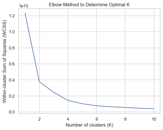
Figure 10: Elbow Technique for Identifying Optimal Cluster
The figure 10 above suggests that the best number of clusters is 2. This inference is based on examining the within-cluster sum of squares (WCSS) for various cluster counts. When the decrease in WCSS significantly diminishes, which happens at two clusters, it indicates that the data can be effectively separated into two unique categories or clusters according to their characteristics. This result also indicates a distinct division or trend in the data that is effectively illustrated by these two clusters.
Performance Evaluation of K-Means Clustering
- Silhouette Score: This score measures how similar an object is to its own cluster (cohesion) compared to other clusters (separation). A higher score, close to 1, indicates better clustering.
- Adjusted Rand Index (ARI): This index measures the similarity between the true labels and the cluster assignments. A value close to 0 suggests random labeling, while a value close to 1 indicates identical clustering.
- Homogeneity: Homogeneity measures how much each cluster contains only data points that are members of a single class. A score of 1 indicates perfect homogeneity.
- Completeness: Completeness measures whether all data points that are members of a given class are also elements of the same cluster. A score of 1 indicates perfect completeness.
- V-measure: The V-measure is the harmonic mean of homogeneity and completeness. It provides a balanced measure that considers both aspects of clustering quality.
Table 1 Showing the Performance Evaluation Of K-Means Clustering
| Classifier Metrics | K-means Clustering |
| Silhouette Score | 0.9848473009062749 |
| Adjusted Rand Index | 0.001063473580164303 |
| Homogeneity | 0.0033838578104207957 |
| Completeness | 1.0000000000000444 |
| V-measure | 0.006744891865820991 |
Source: K -means Clustering
From table 1 above, it is evident that the Silhouette Score is quite high, nearing 1, suggesting that the clusters are well-separated. The Adjusted Rand Index is nearly 0, indicating that the clustering outcomes are not much better than random. Homogeneity is minimal, suggesting that the clusters encompass data points from various classes. Completeness is high, indicating that the majority of data points from each category reside within the same cluster. The V-measure is low, reflecting the balance between homogeneity and completeness in the clustering outcomes.
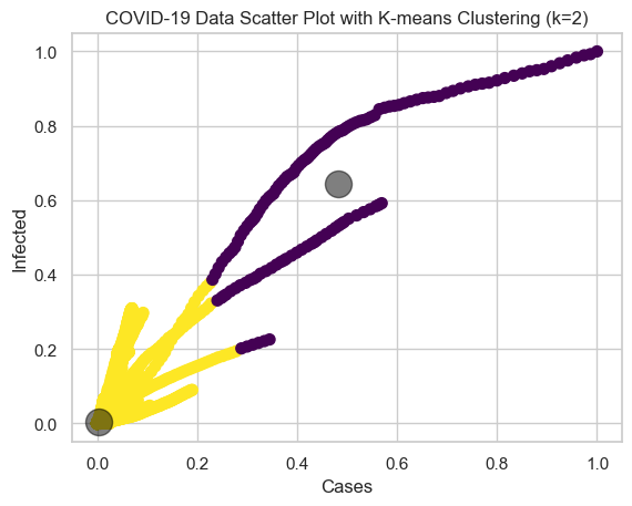
Figure 11: Classification Plot of Spread Covid-19 Pandemics
Cluster 1, representing the least spread of COVID-19, comprises nations with relatively low numbers of confirmed cases, fatalities, and active cases. The central point of the cluster (black circle) represents the common characteristics of countries with low COVID-19, such as low infection rates and successful containment strategies. In contrast, Cluster 2, which signifies the most extensive COVID-19 outbreak, includes nations with significant counts of confirmed cases, fatalities, and ongoing cases, reflecting a serious effect from the pandemic. The core of Cluster 2 demonstrates the typical characteristics of nations experiencing significant COVID-19 such as widespread community spread, overwhelmed healthcare systems, and challenges in virus management. The maps indicate that areas with high concentrations of confirmed, recovered, and death cases of COVID-19 are largely situated in the Northern Hemisphere, especially in places like North America, Europe, and Asia. Areas with cold spots, like sections of Africa and South Asia, might have seen reduced overall infection and recovery rates, potentially because of fewer reported instances, more effective containment strategies, or varying timelines of outbreaks.
CONCLUSION
This study successfully applied spatial and K-means clustering to uncover spatial patterns of COVID-19, highlighting the presence of significant infection clusters across different phases. The results confirm that COVID-19 infections are not randomly distributed but show strong spatial dependence, emphasizing the need for targeted interventions. The integration of spatial autocorrelation and hotspot analysis further enhances our understanding of geographic infection dynamics, offering valuable insights for pandemic response strategies.
FUTURE RECOMMENDATIONS
Based on our findings in this study, we hereby recommend the following for future recommendations:
- Future studies should incorporate dynamic clustering methods to track real-time shifts in infection patterns.
- Expanding the model to include demographic, mobility, and healthcare accessibility data can improve prediction accuracy.
- Utilizing deep learning or hybrid models can enhance clustering performance and disease forecasting.
- Findings should be translated into actionable policies for outbreak containment, resource distribution, and vaccination strategies.
- Developing automated, scalable systems for real-time monitoring can enhance public health response efficiency.
REFERENCES
- Abdullah D, Susilo S, Ahmar AS, Rusli R, Hidayat R. The application of K-means clustering for province clustering in Indonesia of the risk of the COVID-19 pandemic based on COVID-19 data.
- Cowley, H. P., Robinette, M. S., Matelsky, J. K., Xenes, D., Kashyap, A., Ibrahim, N., Robinson, M., Zeger, S., Garibaldi, B. T., & Gray-Roncal, W. (2022). Using machine learning to discover unexpected patterns in clinical data: A case study in COVID-19 sub-cohort discovery.
- Ekpa DE, Salubi EA, Olusola JA, Akintade D (2023) Spatio-temporal analysis of environmental and climatic factor impacts on malaria morbidity in Ondo State, Nigeria. Heliyon 9(3)
- Ge, L., Meng, Y., Ma, W., & Mu, J. (2024). A retrospective prognostic evaluation using unsupervised learning in the treatment of COVID-19 patients with hypertension
- Ghisolfi S, Almås I, Sandefur JC, von Carnap T, Heitner J, Bold T. Predicted COVID-19 fatality rates based on age, sex, comorbidities and health system capacity. BMJ Glob Health. 2020;5(9): e003094.
- Hussein HA, Abdulazeez AM. COVID-19 pandemic datasets based on machine learning clustering algorithms: a review. PalArch’s J Archaeol Egypt/Egyptology. 2021;18(4):2672–700.
- Lau, K. Y. Y., Ng, K. S., Kwok, K., Tsia, K., Sin, C., Lam, C., & Vardhanabhuti, V. (2022). An unsupervised machine learning clustering and prediction of differential clinical phenotypes of COVID-19 patients based on blood tests.
- M., Loncar, G., Cakmak, H., Ruschitzka, F., & Flammer, A. (2024). Phenotype clustering of hospitalized high-risk patients with COVID-19—a machine learning approach. Cardiology Journal, 31, 512-521.
- Noor, N. F. M., Sipail, H. S., Ahmad, N., Annanurov, B., & Mohd Noor, N. (2023). COVID-19: Symptoms clustering and severity classification using machine learning approach. International Journal of Integrated Engineering
- Ogunsakin, R.E. et al. (2024) ‘GIS-based spatiotemporal mapping of malaria prevalence and exploration of environmental inequalities,’ Parasitology Research, 123(7). https://doi.org/10.1007/s00436-024-08276-0.
- Qual Quant. 2021:1–9. Utomo W. The comparison of k-means and k-medoids algorithms for clustering the spread of the covid-19 outbreak in Indonesia. ILKOM Jurnal Ilmiah. 2021;13(1):31–5.
- Rajshekhar, N., Pinchoff, J., Boyer, C. B., Barasa, E., Abuya, T., Muluve, E., Mwanga, D., Mbushi, F., & Austrian, K. (2023). Exploring COVID-19 vaccine hesitancy and uptake in Nairobi’s urban informal settlements: An unsupervised machine learning analysis.
- Sokolski, M., Trenson, S., Reszka, K., Urban, S., Sokolska, J., Biering-Sørensen, T., Lassen, M. C. H., Skaarup, K., Basic, C., Mandalenakis, Z., Ablasser, K., Rainer, P. P., Wallner, M., Rossi, V. A., Lilliu,
- Tadj A, Lahbib SSM. Our overall current knowledge of COVID 19: an overview. Microbes, Infect Chemother. 2021;1: e1262.
- Zubair M, Asif Iqbal MD, Shil A, Haque E, Moshiul Hoque M, Sarker IH. An Efficient K-Means Clustering Algorithm for Analysing COVID-19. In: Hybrid Intelligent Systems: 2021// 2021. Cham: Springer International Publishing; 2021. p. 422–32.